
I design and build digital learning that solves real business problems.

Here are a few projects I've built, and the decisions behind them.

Storyline 360

CEO Spoof: Don't Take the Bait

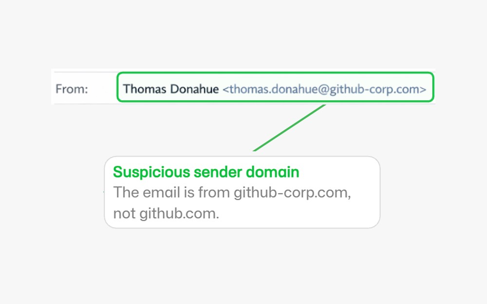
Employees kept falling for fake CEO emails. This Storyline module teaches them to spot the four warning signs and act.

The problem

In a phishing simulation, 38% of employees clicked a link in a fake CEO email (fictional scenario). They could not tell a spoofed email from a real one. And attackers count on that gap.

The solution

A focused 6-slide Storyline module. Learners study four warning signs, then hunt for them in a realistic email, make a judgment call in a scenario question, and leave with three concrete steps.

Key decisions

01

Distractors teach discrimination

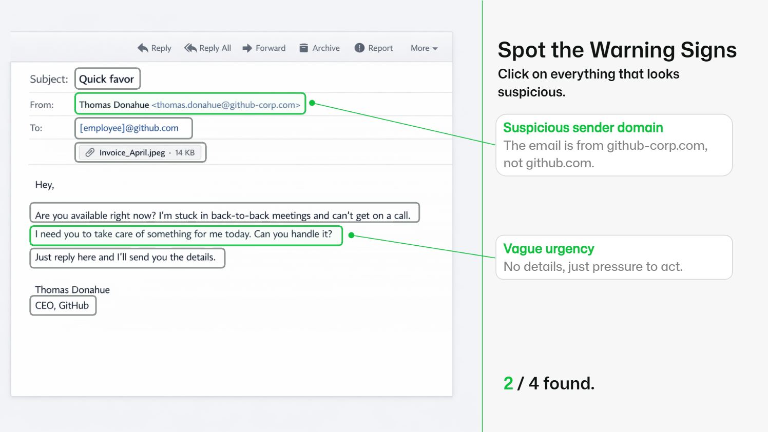
The email holds four warning signs and four plausible, harmless elements, each with its own feedback. Learners practice telling a real email from a fake one.

02

Interaction chosen by purpose

The skill is spotting signs in context, so the core activity is a click-to-find on a realistic email.

03

Working inside brand guidelines

GitHub's public brand material translated into Storyline: fonts, color theme, branded player, applied across all layouts.

Skills shown

Storyline 360 Scenario design Brand theming AI-assisted production (narration, sound, theming) Variables and JavaScript
Preview of the CEO Spoof Storyline module

Fictional internal training, built as spec work using GitHub's public brand guidelines. Not affiliated with GitHub. The simulation statistic is part of the fictional scenario.

Open full screen
Read the full story

Where this piece came from. It started at my kitchen table. My wife showed me an email, supposedly from her school principal. Subject line: "Dringende Aufgabe." Urgent task, stuck in meetings, cannot call, please just reply here. Her reaction: "Das kommt mir irgendwie komisch vor." Something felt off, and she could not say why. Neither could I at first, even though I have built data security courses before. It was a spoofing attempt, and it took both of us too long to be sure. That gap between feeling and knowing is what this module closes.

Who it is for. Employees who clicked a link in an internal CEO-spoofing simulation. They fell for it because nobody ever taught them what to look for. The module gives them one clear outcome: spot the warning signs in a suspicious email and take the right action.

Why training is the right fix here. Before building anything, I ran the topic through a question Mager and Pipe asked back in the 1970s: could they do it if their life depended on it? If the answer is yes, training will not solve the problem. For spotting spoofed emails, the answer is no. That is a genuine skill gap, and a course is the right intervention.

Constraints. Solo build in a realistic timebox, next to client work. The piece also had to work as a public portfolio item, so I chose a fictional scenario around a real brand and labeled it clearly as spec work. All numbers, including the 38%, belong to that fictional simulation.

The decisions I care about most.

The interaction shows a realistic email containing four warning signs and four plausible, harmless elements. Clicking a harmless element triggers its own feedback explaining why it looks suspicious and why it is fine. Real judgment means telling signal from noise, so the module trains exactly that discrimination instead of rewarding random clicking.

I picked the core interaction by learning purpose. The skill is recognizing patterns in context, so the centerpiece is a click-to-find on a full email with a counter, per-element feedback, and completion logic. A matching activity would have tested recall, and recall was never the gap.

The module is built to GitHub's public brand guidelines. I translated the brand material into Storyline: set up the fonts, created a font theme and a color theme, branded the player, and applied all of it across the layouts, from prebuilt slides to slides I built from scratch. I wanted this piece to show that I can pick up a client's brand guidelines and deliver a course that looks like it belongs to them.
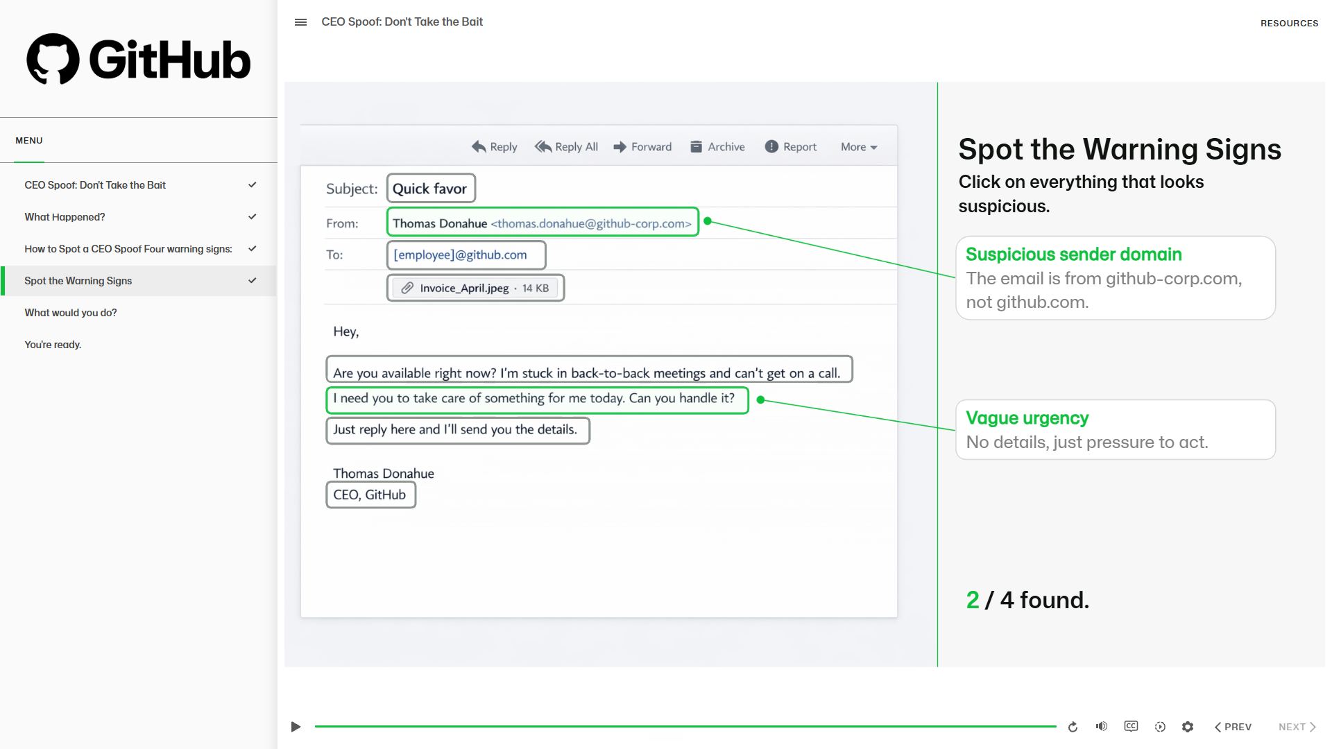
Full published view of the module with the GitHub-branded player
The published module with the GitHub-branded player: logo, menu, and progress checkmarks.

Where AI fit into the workflow. The narration is an AI voiceover from ElevenLabs. I tested Storyline's built-in AI voices first and preferred the ElevenLabs result. The feedback sound effects came from Storyline's AI Assistant, and the theme setup was supported by my own Storyline Theme Genie GPT. For a solo build with limited resources, AI voiceover was the right call, and it can always be swapped for a professional speaker before a client rollout. To me this is the actual skill: knowing where AI fits into the production workflow and where it does not.

What I would improve. The phishing email itself is an AI-generated image. It looks convincing and it was fast to produce. It is also invisible to screen readers, and the text does not scale. Next time I would rebuild the email natively in Storyline with text elements and shapes. Slower to build, better for every learner.

A full video walkthrough of the build is in production on my YouTube channel.
360° Web Application

ADR 360° Tank Truck Walkthrough

A tank truck you can walk around in the browser. Built for ADR tank training, officially recognized by DIHK nationwide.

Built during my time as Learning Designer at DEKRA SE, for DEKRA Akademie GmbH. All product information on this page comes from DEKRA's own public materials.

The problem

ADR is the European framework for transporting dangerous goods by road. The practical part of ADR tank training depends on a real tank truck, and arranging one is often unreliable and cost-intensive. Even with a vehicle on site, the most important views are the hardest ones to get.

The solution

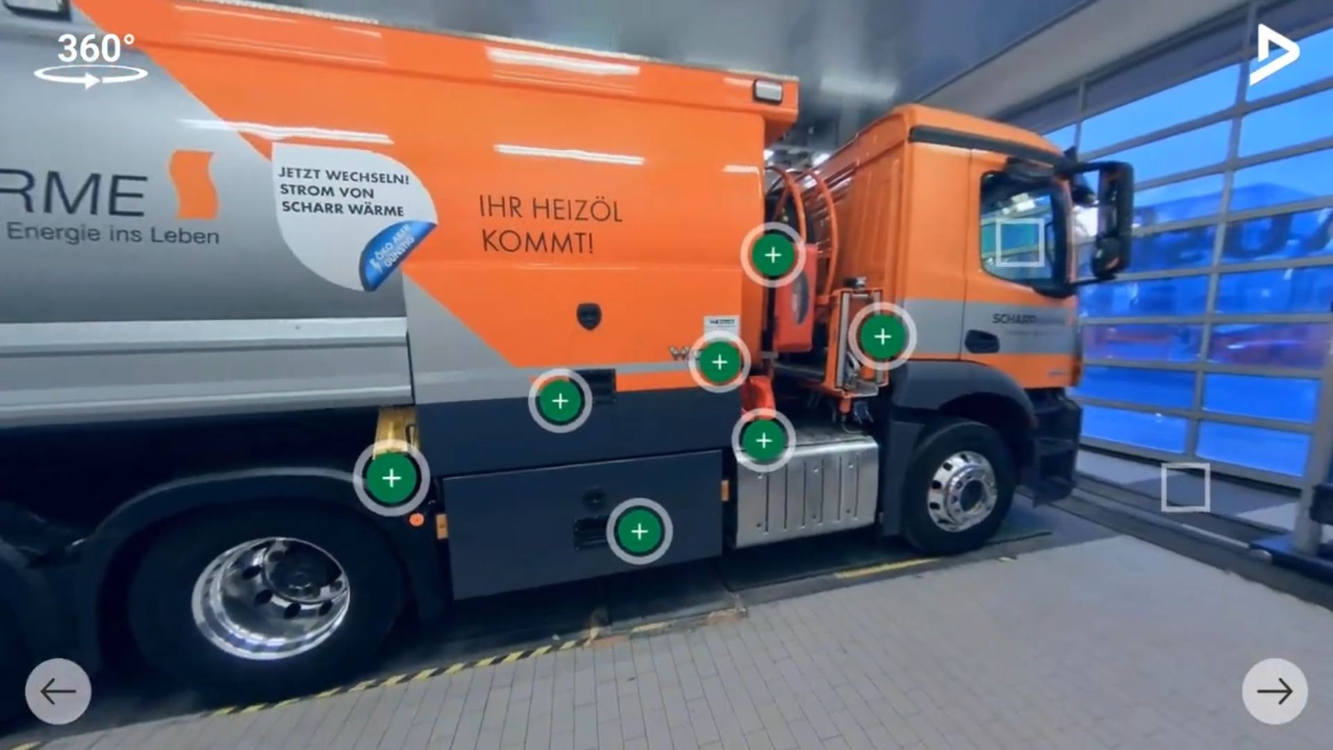
An interactive 360° web application that makes the tank truck fully explorable in the browser: every position, every detail view, including the angles the real vehicle rarely allows. Every learner gets every view, close up, anywhere.

Recognition: Officially recognized by DIHK (German Chamber of Commerce), used nationwide.

Key decisions

01

Real 360° photography over a 3D model

The priority was authentic detail. Rebuilding areas like the valve cabinet in 3D would have cost far more than photographing the real thing.

02

Deliberately flat navigation

One simple rule throughout: move freely between the 360° positions, open a detail, then return to where you came from.

03

Perspectives by testing, content by experts

Camera positions came from testing ahead of the shoot. The hotspot content came from the subject matter experts.

Skills shown

360° media production Learning architecture SME collaboration Web application development LMS integration
Preview of DEKRA Akademie's public demo video of the 360° application

Screenshot from DEKRA Akademie's public demo video. Clicking the button loads content from YouTube.

The video is in German. The application was developed for the German-speaking market.

Open full screen
Read the full story

The setting. ADR tank training includes a practical demonstration on a tank truck. Arranging a real vehicle is often unreliable and cost-intensive, and even with a vehicle on site, the practical part fights physics: the top of the tank takes safety equipment and a briefing, the view into the dome takes a completely emptied tank, and twenty people around one vehicle see very little of the details that matter. DEKRA decided to build a digital alternative. I owned the project as Learning Designer, from first sketch to LMS deployment, in close collaboration with DEKRA's subject matter and LMS teams. The application was officially recognized by DIHK and is used nationwide.

Why real photography. My default leans toward 3D models: easier to update and able to show states you cannot photograph. Here the priority was authentic detail. Areas like the valve cabinet are deep and dense, and rebuilding them in 3D would have cost far more than photographing the real thing. With real photography, learners see exactly the vehicle they will meet in practice.

Why the navigation is deliberately flat. The application follows one simple rule: move freely between the 360° positions, open a detail, then return to where you came from. There are no sideways jumps inside detail levels, even where a view like the valve cabinet holds another layer of markers. That restraint keeps learners oriented at all times, and orientation is half the battle in any virtual space.

Where the content came from. Camera positions came from measuring and testing with the 360° camera ahead of the shoot: enough distance to keep everything recognizable on a long vehicle, few enough positions to stay navigable. By the time we were on site, we were ready to shoot. The hotspot content came from the subject matter experts. My job was to give their knowledge a structure learners can navigate.

My role

  1. Tool selection: Evaluated and selected the software and hardware for the project, from the 360° rig to the authoring stack.
  2. On-site production: Coordinated and conducted the 360° photography shoot at the vehicle location, capturing every angle the application needed.
  3. Instructional design: Developed the storyboard and the overall learning architecture: what to see, when, and why it matters.
  4. Development: Built and implemented the full interactive application, including navigation, hotspots, and progress logic.
  5. Subject matter collaboration: Worked closely with domain experts to make sure every label, hotspot, and explanation was technically accurate.
  6. LMS integration: Collaborated with LMS specialists to deploy the application inside DEKRA's learning environment.

What I would improve. The application itself held up. After many review loops, nothing made it into the final version that I would change today. What I would streamline is the process around it: with today's tools, several of those loops would be shorter.

The demo video was published by DEKRA Akademie and is in German.

Custom GPT

Storyline Theme Genie

A custom GPT that turns brand material into a complete Storyline theme. One user timed it: 2 minutes 43 seconds from blank project to finished theme.

The problem

A custom theme in Storyline means working through 16 color slots, with little guidance on what Accent 1 or Control 1 actually do. Many designers stay on the default theme or lose an hour to research before they build a single slide.

The solution

Storyline Theme Genie takes whatever brand material exists (guidelines, screenshots, a website, a PDF) and returns a complete, brand-accurate color and font theme with a visual preview, ready to transfer into Storyline.

Key decisions

01

Born from retention data

A YouTube retention graph showed viewers skipping my walkthrough of all 16 color slots. So I built the shortcut.

02

It completes the palette

Most brand palettes hold four or five colors, while Storyline asks for sixteen. The Genie fills the gap with reasoned suggestions.

03

Shipped early, paid in feedback

Released to the community in exchange for honest feedback, which has been shaping it since.

Skills shown

Custom GPT development Prompt design Brand systems Workflow tooling

The grid shows the GitHub theme built for the CEO Spoof module on this page: the exact theme behind that project.

Get the Genie
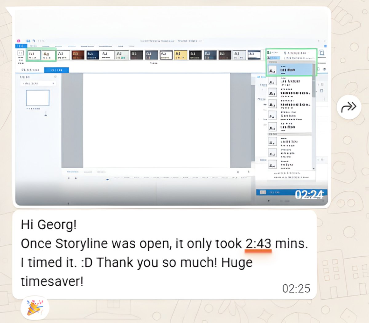
Hi Georg! Once Storyline was open, it only took 2:43 mins. I timed it. :D Thank you so much! Huge timesaver!
Former client
I have been using this in my recent projects and have loved that I can just drop my Storyboard and/or other related assets into the GPT and it uses whatever I have while also filling in additional, corresponding colors to complete the full Storyline 16-color themes.
Hayley Conn, Instructional Designer
Read the full story

Where it came from. A retention graph from one of my YouTube videos showed the moment people skipped ahead: right where I walked through all 16 Storyline color slots, one by one. Viewers were telling me something. They did not want a lesson on color slots. They wanted a working theme so they could start building. So I built the shortcut.

What it does. You give the Genie whatever brand material you have: guidelines, screenshots, a website, a PDF. It maps the colors to all 16 Storyline slots, suggests font alternatives when the brand fonts are out of reach, and shows a visual preview before anything touches Storyline. When a palette only holds four or five colors, it completes the remaining slots with reasoned, matching suggestions.

How people use it. I use it with my coaching clients to get them past setup and into building, because that is where the learning happens. A former client timed herself: 2 minutes and 43 seconds from blank project to finished theme. Another user described dropping her storyboard and assets straight into the GPT and letting it complete the full 16-color theme around what she already had.

WhatsApp message from a former client: 2:43 minutes from blank project to finished theme
The original message: 2 minutes 43 seconds from blank project to finished theme.

The honest outlook. Storyline's AI Assistant can now transfer the 16 hex codes into a theme directly, so I am watching closely whether my own tool becomes redundant. Until then it covers the step that matters most: getting from brand material to a theme worth transferring.

Portrait of Georg Volmer

Need learning like this built, or a team that can build it? Let's talk.